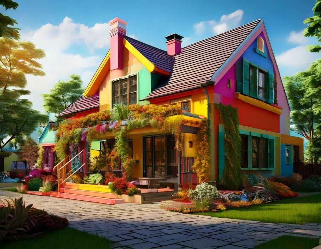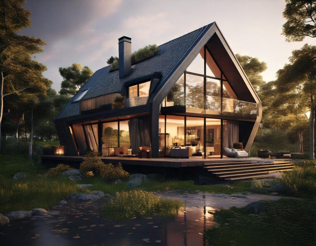
When it comes to architecture, we often focus on the structural elements, materials, and functionality of a space. However, one of the most powerful tools in an architect’s design arsenal is color. Colors can dramatically influence the mood, perception, and overall experience of a space. Whether it’s a calming blue for a serene bedroom or an energizing red in a creative workspace, color can make or break the ambiance. Let’s dive into how different color palettes impact architectural design and the mood of those who interact with the space.
1. The Psychological Impact of Colour
Colors are not just a thing of the eyes; they also carry emotional meanings and influence behavior. For architecture, this would mean an understanding of the psychological impact of colors towards creating spaces which evoke the right moods and functionality. Here’s how common colors affect mood:
Red – busy and bold, energy, passion, potential for heart rate increase, people might think of as an urgency or as a gym, a kitchen, or space for arts. If overly used, it becomes a whole lot too busy.
Blue: These colors are calming and soothing. This would be appropriate for bedrooms, spas, or other care facilities in the effort to ease the mind. Even more subtly, shades of blue may go from being a cool refreshing tone to a warm inviting tone.
Yellow: It’s associated with happiness and optimism and is used to warmly brighten up and illuminate a room through its promising radiance. These should be used in spaces like kitchens, living rooms, or combined living spaces where lightness and energy are needed. Avoid overusing too much yellow, and the whole space can end up getting overwhelmed.
Green: This is refreshing and calming due to its natural balance property. It is suitable for places where harmony is intended to be formed, for instance, living rooms, offices, or wellness centers. Because it ranges from earthy tones to rather vibrant shades, it goes well with most other design elements.
White: White opens up space and thereby gives the feeling of spaciousness and airiness. While it is often employed in modern and minimalist designs, it can sometimes feel too stark or sterile without the right accents.
Black: While often used as an accent, black has elegance and depth that really adds a touch of sophistication to the space. Conjoining it with other light tones will have a contrasting layout that embodies bold, dramatic elegance and new age.
2. Color and Spatial Perception
Color also determines how a particular space might be perceived. Light colors give the illusion of an open and airy, larger room; it is ideal for small or confined spaces. White and pastel shades as well as light neutrals are perfect since they reflect more light, hence giving an illusion of space. Darker colors, such as deep blue, grey, or brown, absorb the light and give the impression of a cozier and intimate space.
In long hallways or corridors, if the far walls are lighter in color and side walls are darker, then it can be a means of stretching out or widening the space. Through this means, architects and designers can change the spatial experience without actually changing the actual dimensions of a room.
3. How Color Affects Flow

Colors also give meaning to the flow of traffic through a building. In large or open space buildings, color zoning is very suitable where separation of areas without use of barriers is concerned. For example, in a commercial setting, there may be definitions using warm tones such as oranges or yellows for areas that require more collaboration and cooler tones such as blues or greens to indicate focus and relaxations areas.
Another is a color palette that allows for harmony: contrasting colours instead bring out excitement and energy. Neutral tones can be used as a background that sets the base for brighter color accents that add dynamics but not overwhelming to the senses.
4. Cultural and Regional Color Preferences
Colour preference would also vary from culture to culture and region to region, further complicating the process. For example, red is considered a symbol of good luck and prosperity in most Asian cultures, while white signifies mourning. In Scandinavian design, neutral undertones in greys and whites are ordinarily used maximally to allow as much light into a home as possible when days are long and dark for most months of the year.
All such cultural associations should be considered by the global architects so that their designs can fit within the intended emotional response required as well as resonate to the cultural context of the space.
5. Balance between Aesthetics and Functionality

The use of color in architecture will always be more than just aesthetic. Functionality is even more important. For example, hospitals are often painted in calming colors like light blues or greens to install feelings of healing and reduce anxiety among patients. Schools, for their part, might opt for more bright, lively colors such as yellows or oranges to encourage creativity and stimulation to the learning process.
For that reason, architects are supposed to find a balance between attractive spaces and proper colors that enliven the functionality of the environment. It all goes down to finding the right tone, saturation, and placing the colors to serve both in the experience of the user and the purpose of the building.
6. Timelessness and Trends
While architectural trends are the guideline for color at best, it is equally important to look at the life cycle of a palette. Neutrals such as white, grey, and earth tones are timeless, ensuring the architecture remains applicable in the face of changing design fads. Bolder color use can be done through furniture, artwork, or accents in a room, giving flexibility in restyling space without requiring extreme renovations.
The architects should consider how their colors will wear and whether the color palette that they opt for will allow modifications to accommodate changing designs over time.
Conclusion: Designing Emotional Spaces through Colour
Color, among other things, can be a real foundation stone in architecture: shaping emotions, improving functionality, and transforming spaces. It is a tool that can determine the kind of ambience the space gets – whether the owner will feel expansive or intimate, energized or serene. Using this understanding of psychological, cultural, and spatial effects of color, architects can now create environments not only looking marvelous but also improving the quality of life for the occupants.


thanks 😗
Thank you! We’re glad you had a great experience with us 🤩